
Website design changes almost every year, just like fashion. You can’t master a proper way to design website because – after all – it’s about your choices and your users’ reviews.
Each visitor that lands upon your website must enjoy their experience; and these few trends and factors might assist you to understand what people are trying to find at the moment. From how to enhance the visuals of your website to deliver the messages in a persuasive way, you will discover all of it here.
- Minimal Design
If you want to learn how to design a website that is appreciated by everyone, the first-class idea is to start with a minimalist layout. As they say, less is more. Modern website design mostly relies on fewer elements that are bold, fashionable, and convincing. When deciding on a minimalist website, you select the perfect way to get attention. Visitors will instantly direct their interest to the content. The navigation is smooth and the design factors are kept easy.
A minimalist website is useful because it’s far easier to manage, it gives great performance and it fits all types of businesses.
- Responsive
In these times where mobile phones are used every day, modern website design must focus on responsiveness. Mobile-friendly websites are a must nowadays, but they’re pretty complex to develop. Almost all modern websites are optimized for accessing them on different systems such as smartphones and tablets. If your website is remarkable on a laptop and has plenty of functionalities, it may be useless until you make it accessible for mobile users as well.
Using Typography the right way!
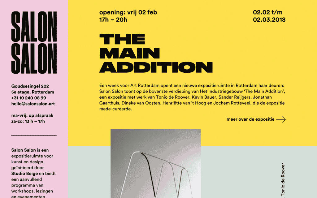
Image via Pinterest
All the quality websites know how to deliver a message. One of the factors that make a difference is typography. Even though it might not appear essential in the beginning, the font you pick for your website can decide whether or not the visitor will continue reading your content. You have a large selection of fonts to select from, so do your research beforehand.
The font you use along with the dimensions you choose for it will dictate where the attention of the visitors be. Based on these details, you help visitors go through your website simpler and faster.
Color Palettes
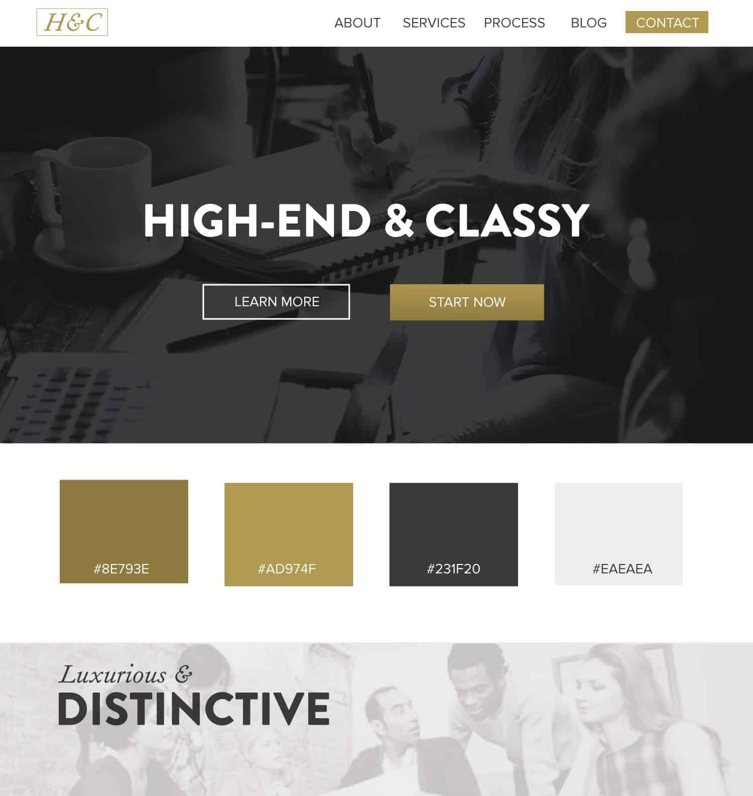
Image via Pinterest
Color palettes are more limited in a modern web design, and they need to comply with the trends of the year. For starters, you must know the color schemes you choose will have an impact on the feelings and choices of people through psychology. It is proven that those who use too many colors can confuse visitors, which will end up in a distracting website that doesn’t appeal to people or gain their loyalty.
Changing the nuances that you use in your website in the future is only suggested if you don’t have a consistent brand that cannot suffer any changes.
Negative Space
Image via Pinterest
A modern website should never be too crowded. Using too many elements will make the website both slow and unpleasant. Using negative space to give visitors a chance to determine what they want to focus on is very important. An appropriate website layout will constantly contain some negative space to consolidate the whole website.
Adding a few empty areas across the margins of the website, the header, or the footer will give your site visitors a break. Minimalist websites are always more open, leaving users a lot of negative space to let their eyes rest.
CTA (call-to-action)

Image via Pinterest
CTA (call-to-action) buttons or sentences must convince users who see them into doing a certain action. You can notice that maximum advertisements incorporate CTAs due to the fact that they’re effective in turning potential clients into actual ones. The same implies to the modern website design as well.
You need to position CTAs well so that they’re smooth to access. The most vital function of CTAs is to gather contact information. The first place to implement CTAs is at the end of any blog post and in the sidebars.
Product Images
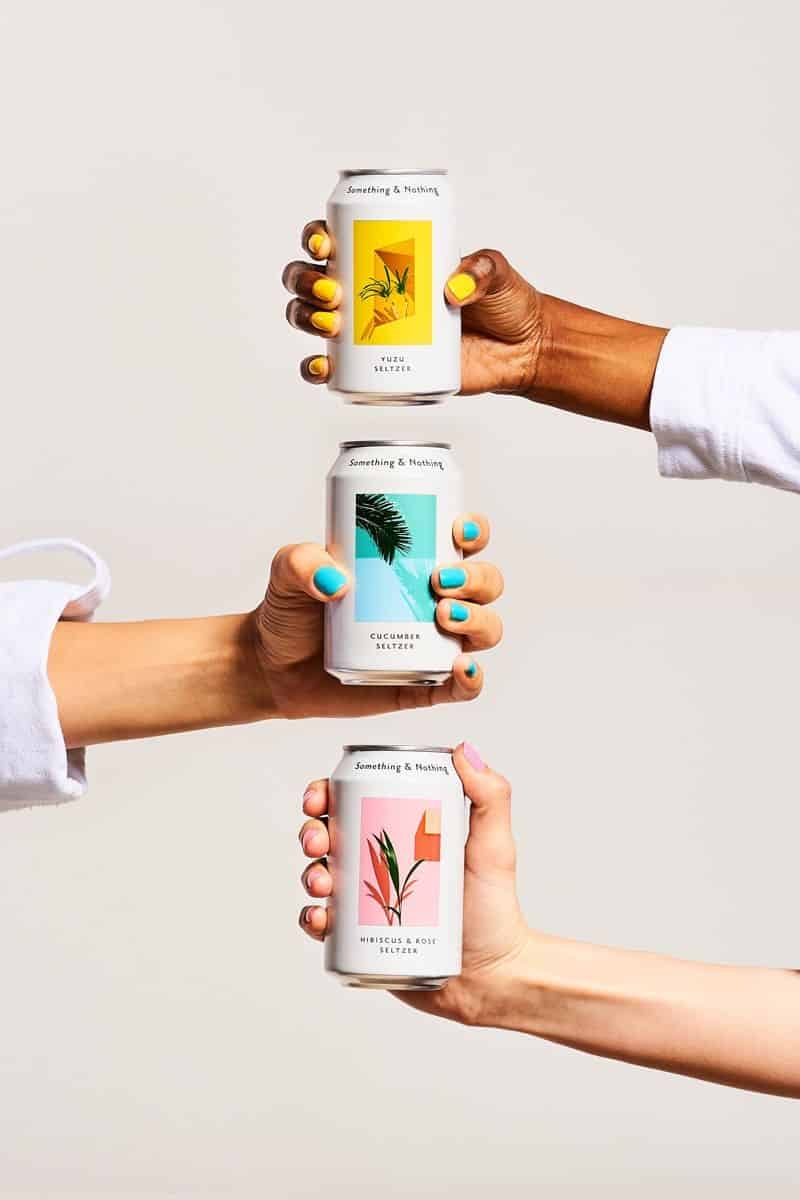
Image via Pinterest
If you are interested in designing a business website, using images is the easiest way to draw attention towards a product. Large product images that can be zoomed in offers users the impression that they can see every little element of the product, making it more valuable.
This way, users can trust your website and prefer your products over others. Some websites even offer 360-degree visualization in their products. Remember that visuals are the first things that catches the visitor’s eye.
Conclusion
You are now probably convinced that website creation has nearly no boundaries. The tactics are so various and numerous that you really can’t choose one without information on what it is all about. Keep in mind that your website is the connecting bridge between you and your customers, so put enough effort into it to acquire that actual outcome that everybody will discover captivating.